CANFIELD BEAUTY
Canfield Beauty is a new division of Canfield Scientific, Inc., created to market imaging hardware and software geared towards the beauty/skincare retail industry.
Role: UX, UI, Graphics, Interaction, HTML & CSS
CANFIELD BEAUTY
Canfield Beauty is a new division of Canfield Scientific, Inc., created to market imaging hardware and software geared towards the beauty/skincare retail industry.
Role: UX, UI, Graphics, Interaction, HTML & CSS
CANFIELD BEAUTY
Canfield Beauty is a new division of Canfield Scientific, Inc., created to market imaging hardware and software geared towards the beauty/skincare retail industry.
Role: UX, UI, Graphics, Interaction, HTML & CSS
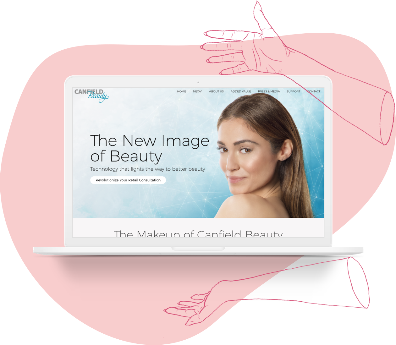
CANFIELD BEAUTY
Canfield Beauty is a new division of Canfield Scientific, Inc., created to market imaging hardware and software geared towards the beauty/skincare retail industry.
I worked directly with our marketing department to design a website that would introduce Canfield Beauty as a disctinct entity from Canfield Scientific. A more immediate purpose of this site was to help in the launch of NEXA®, Canfield Beauty’s flagship product.
CANFIELD BEAUTY
Canfield Beauty is a new division of Canfield Scientific, Inc., created to market imaging hardware and software geared towards the beauty/skincare retail industry.
Role: UX, UI, Graphics, Interaction, HTML & CSS
Launch Year: 2017
INTRO
Canfield Beauty is a division of Canfield Scientific intended to target the retail beauty industry with services including analytics, customer insights, and technology to bring customers back to physical shopping. To design this website, I worked directly with the marketing department for copy and our in-house graphic designer for the logo and photo retouching. Everything else, including HTML and CSS, were my responsibility.
GOALS
GOALS

Design a website that would introduce Canfield Beauty as a distinct entity from Canfield Scientific, in both style and content.
Design a website that would introduce Canfield Beauty as a distinct entity from Canfield Scientific, in both style and content.
Design a website that would introduce Canfield Beauty as a distinct entity from Canfield Scientific, in both style and content.
Design a website that would introduce Canfield Beauty as a distinct entity from Canfield Scientific, in both style and content.
Launch and introduce NEXA®, Canfield Beauty’s flagship product.
Launch and introduce NEXA®, Canfield Beauty’s flagship product.
Launch and introduce NEXA®, Canfield Beauty’s flagship product.
Launch and introduce NEXA®, Canfield Beauty’s flagship product.
Launch and introduce NEXA®, Canfield Beauty’s flagship product.
Inform visitors how Canfield Beauty could benefit their beauty brand and attract people to their brick and mortar locations.
Inform visitors how Canfield Beauty could benefit their beauty brand and attract people to their brick and mortar locations.
Inform visitors how Canfield Beauty could benefit their beauty brand and attract people to their brick and mortar locations.
Inform visitors how Canfield Beauty could benefit their beauty brand and attract people to their brick and mortar locations.
Inform visitors how Canfield Beauty could benefit their beauty brand and attract people to their brick and mortar locations.
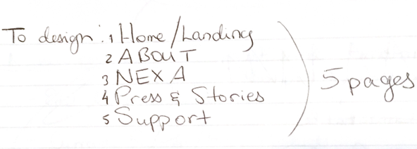
PLANNING
We began by identifying the pages that we needed to create and creating a preliminary outline for the content that they would contain.
PLANNING
We began by identifying the pages that we needed to create and creating a preliminary outline for the content that they would contain.
PLANNING
We began by identifying the pages that we needed to create and creating a preliminary outline for the content that they would contain.
PLANNING
We began by identifying the pages that we needed to create and creating a preliminary outline for the content that they would contain.
PLANNING
We began by identifying the pages that we needed to create and creating a preliminary outline for the content that they would contain.
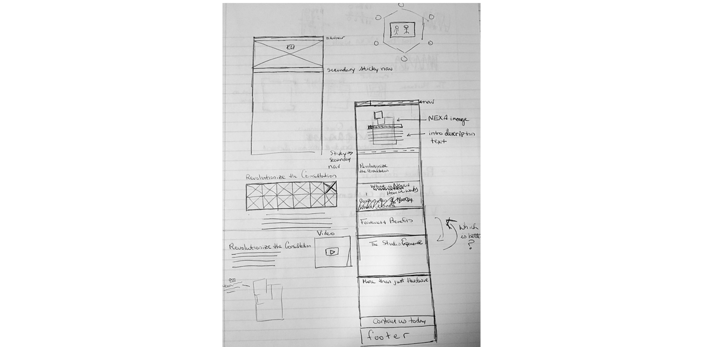
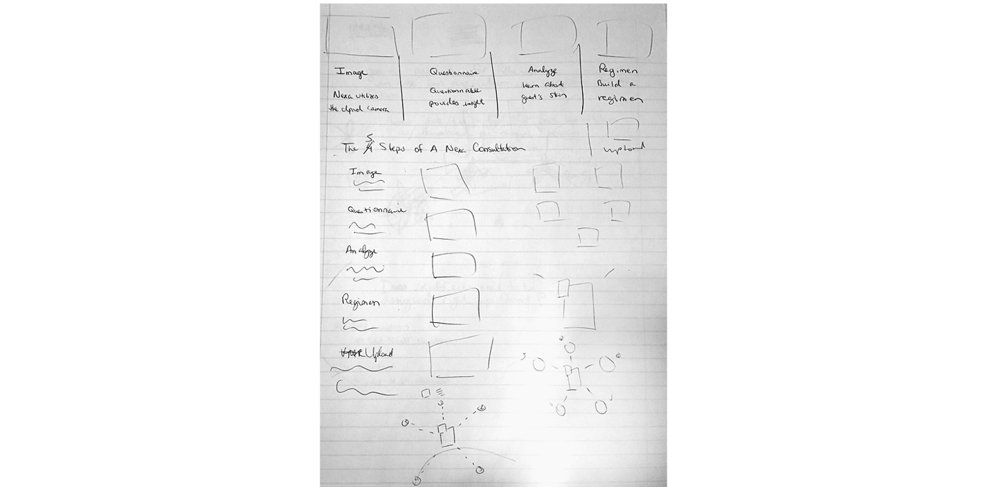
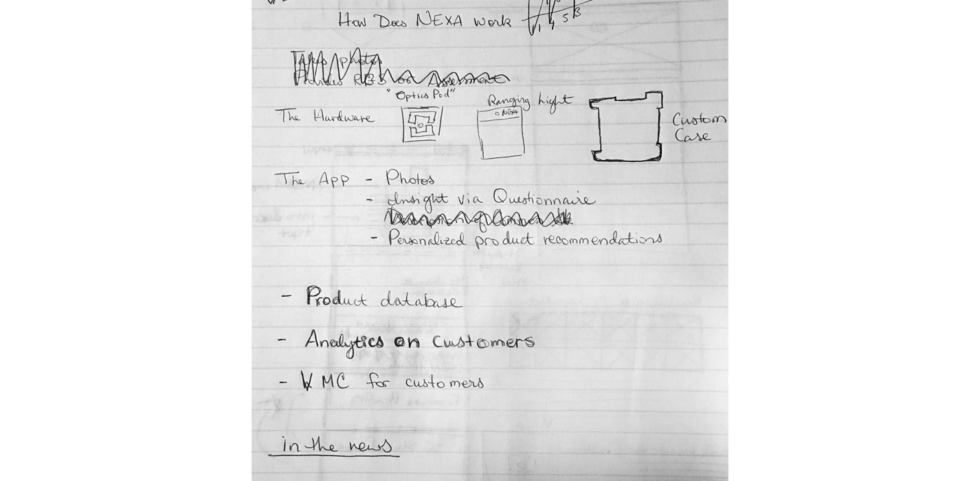
SKETCHING
Once we had an working idea of what the content would be, I went on to start sketching ideas for how to display it, quickly going through several iterations before feeling comfortable enough to move on to the next step.
SKETCHING
Once we had an working idea of what the content would be, I went on to start sketching ideas for how to display it, quickly going through several iterations before feeling comfortable enough to move on to the next step.
SKETCHING
Once we had an working idea of what the content would be, I went on to start sketching ideas for how to display it, quickly going through several iterations before feeling comfortable enough to move on to the next step.
SKETCHING
Once we had an working idea of what the content would be, I went on to start sketching ideas for how to display it, quickly going through several iterations before feeling comfortable enough to move on to the next step.
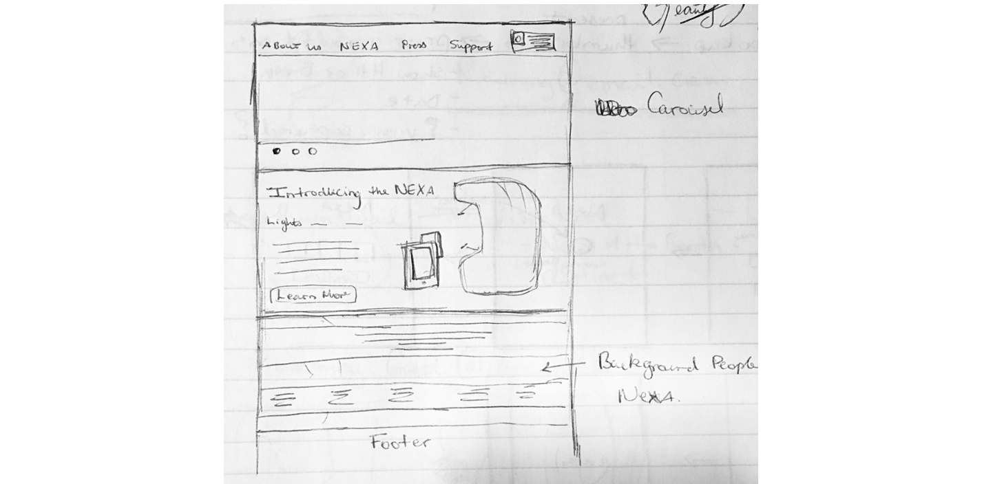
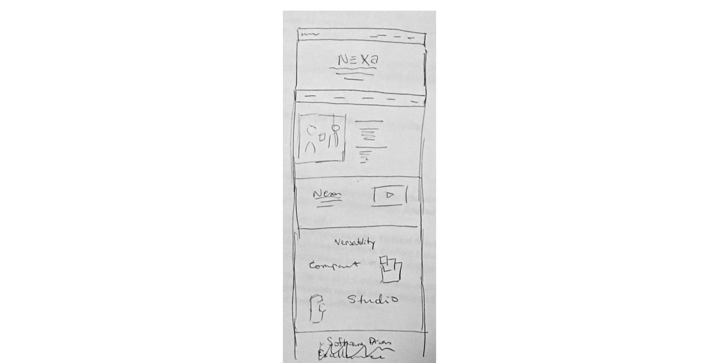
WIREFRAMING & PROTOTYPING
From sketches, I moved on to creating medium-fidelity wireframes in Sketch, to better communicate ideas with my colleagues.
At this point, an obvious challenge for the NEXA product page was the amount of content that I had to plan for. Laying out all the content sequentially would result in a page that scrolled for a very long time. I had to devise a solution that allowed for all the content to be displayed but also resulted in an easy to skim page for the end user.
WIREFRAMING AND PROTOTYPING
From sketches, I moved on to creating medium-fidelity wireframes in Sketch, to better communicate ideas with my colleagues.
At this point, an obvious challenge for the NEXA product page was the amount of content that I had to plan for. Laying out all the content sequentially would result in a page that scrolled for a very long time. I had to devise a solution that allowed for all the content to be displayed but also resulted in an easy to skim page for the end user.
WIREFRAMING & PROTOTYPING
From sketches, I moved on to creating medium-fidelity wireframes in Sketch, to better communicate ideas with my colleagues.
At this point, an obvious challenge for the NEXA product page was the amount of content that I had to plan for. Laying out all the content sequentially would result in a page that scrolled for a very long time. I had to devise a solution that allowed for all the content to be displayed but also resulted in an easy to skim page for the end user.
CHALLENGES WITH CONTENT
From sketches, I moved on to creating medium-fidelity wireframes in Sketch, to better communicate ideas with my colleagues.
At this point, an obvious challenge for the NEXA product page was the amount of content that I had to plan for. Laying out all the content sequentially would result in a page that scrolled for a very long time. I had to devise a solution that allowed for all the content to be displayed but also resulted in an easy to skim page for the end user.
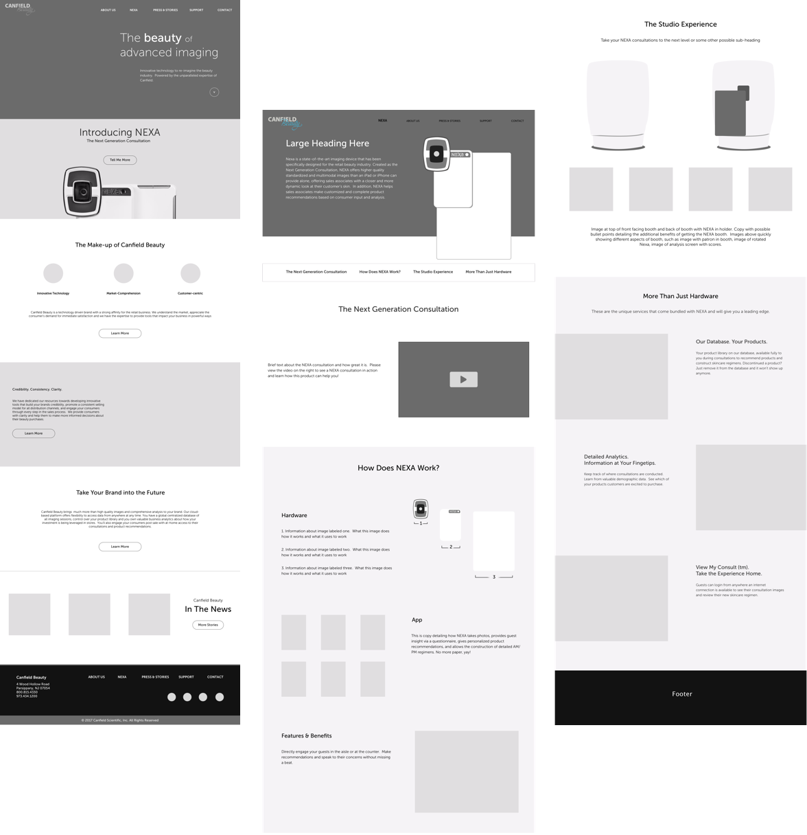
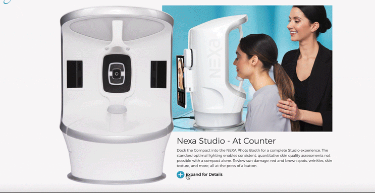
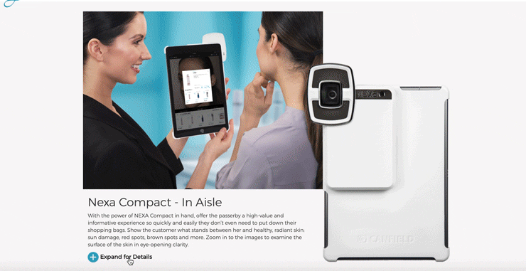
The solution I eventually landed on was to create two expandable sections for each of the versions of NEXA available. This allowed for a page that did not appear overly long and allowed users to delve deeper into whichever section they wanted to read more information on.
The solution I eventually landed on was to create two expandable sections for each of the versions of NEXA available. This allowed for a page that did not appear overly long and allowed users to delve deeper into whichever section they wanted to read more information on.
The solution I eventually landed on was to create two expandable sections for each of the versions of NEXA available. This allowed for a page that did not appear overly long and allowed users to delve deeper into whichever section they wanted to read more information on.
The solution I eventually landed on was to create two expandable sections for each of the versions of NEXA available. This allowed for a page that did not appear overly long and allowed users to delve deeper into whichever section they wanted to read more information on.
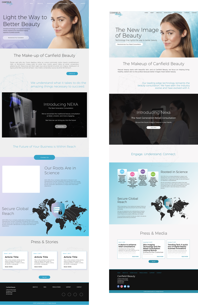
JOURNEY TO COMPLETION
The final published edition of the website differed quite a bit from my initial high fidelity mockups, mostly in color scheme, typography, and sizing. The adjustments were made based on feedback sessions from the marketing team. The left image is my mockup, still missing some final content. The right image is the published page.
CONCLUSIONS
In looking back on this project, several things stand out to me now. For instance, the landing page is missing the opportunity to inform the visitor about product value by having such generic imagery in the header. Important information about how we bring value to customers is buried away on a page that visitors may not navigate to. Everything could benefit from more balanced sizing of images/typography and increased whitespace.
This was my first large-scale website project. Most of these issues resulted from my inexperience within the field. If I were to revisit this project today, the result would benefit significantly from how far my skills and confidence have come.
♥︎ Have a great day!