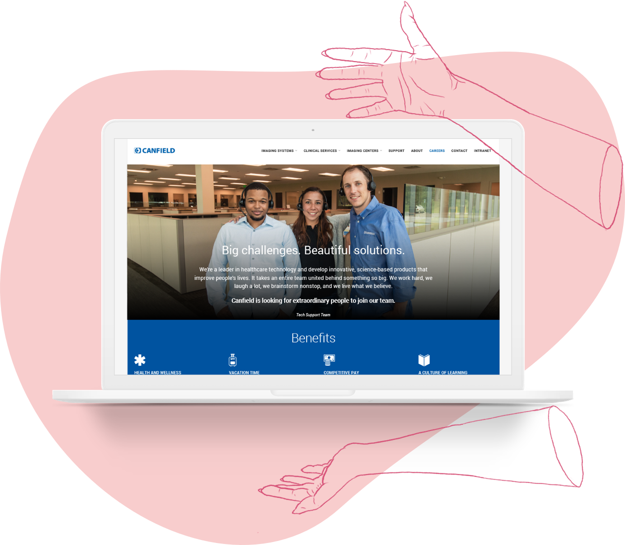
WEBPAGE REDESIGN
With Canfield Scientific, Inc.’s new acquisitions, we now had jobs available at four locations. The careers page needed to be updated to support filtering by location as well as an overall refresh.
Role: Evaluation and Concept Development, Wireframing, Visual Design
INTRO
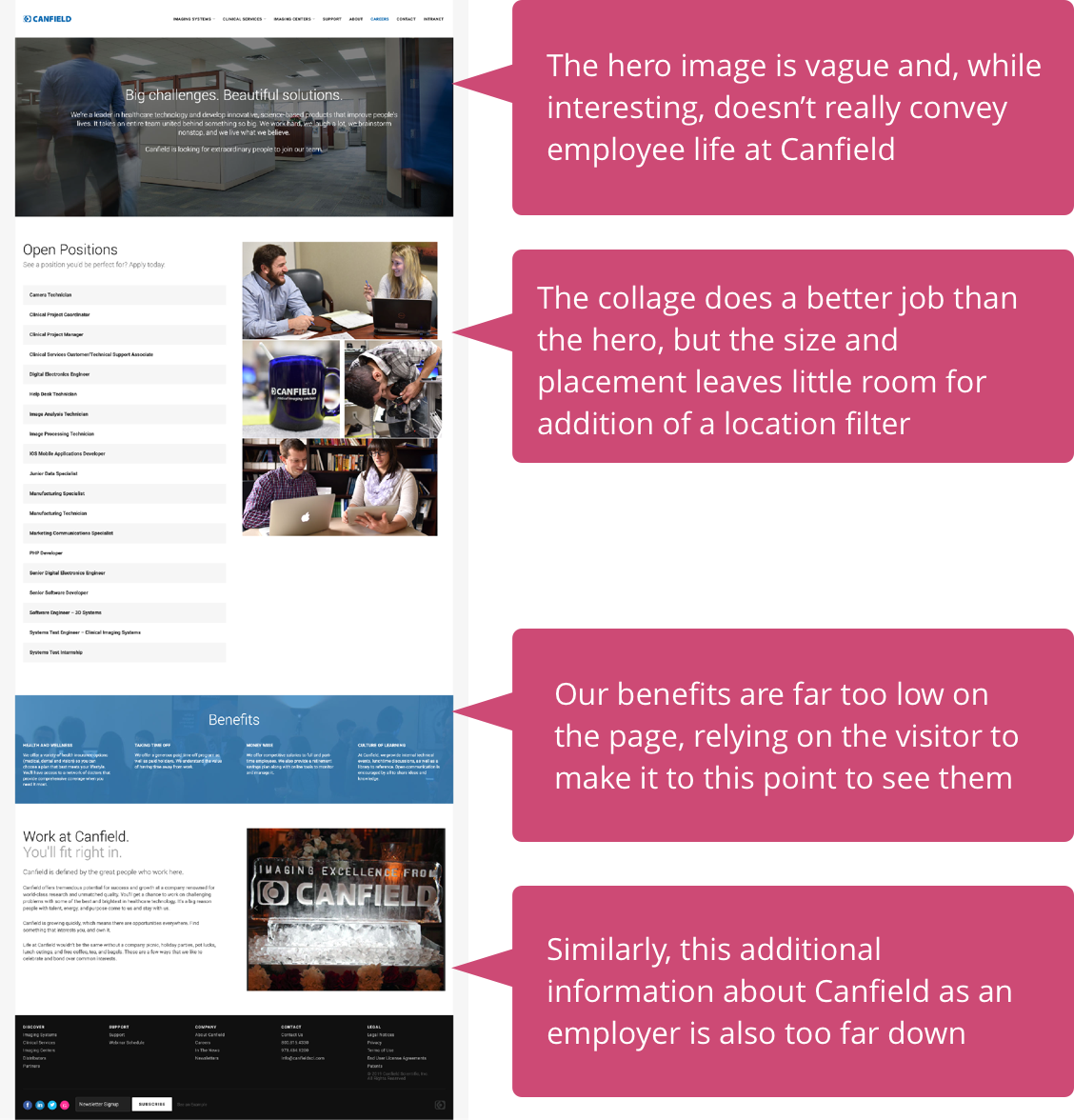
In reevaluating the design of our careers page, I wanted to optimize the information hierarchy so that pertinent information was available to the user in a logical order. To my mind, a careers page is not the place to break conventions or implement the unexpected. A job seeker is likely to be stressed and might be applying to multiple jobs. If information and job postings are not clearly laid out, the frustration could cause them to give up and navigate away. In this instance, it wouldn’t mean just losing out on a visitor but losing out on potential talent.
INTRO
In reevaluating the design of our careers page, I wanted to optimize the information hierarchy so that pertinent information was available to the user in a logical order. To my mind, a careers page is not the place to break conventions or implement the unexpected. A job seeker is likely to be stressed and might be applying to multiple jobs. If information and job postings are not clearly laid out, the frustration could cause them to give up and navigate away. In this instance, it wouldn’t mean just losing out on a visitor but losing out on potential talent.
GOALS
GOALS

Refresh the overall look of the page by using photos prominently displaying our employees. Optimize the structure so that pertinent information is available without having to scroll too far.
Design a simple location filter with straightforward functionality.
With further expansion always possible, the new format should be able to adapt without major changes being necessary.
EVALUATION AND OBSERVATIONS
I began by evaluating the layout of the current careers page and recording my general observations. The timeline for this project was short, so I wanted to head straight into wireframing with a solid plan in mind. I knew I wanted to move company information and benefits up higher on the page to draw in the potential candidate. Then, continue into an easy to parse list of open positions.
DESIGNING THE FILTER & WIREFRAMING
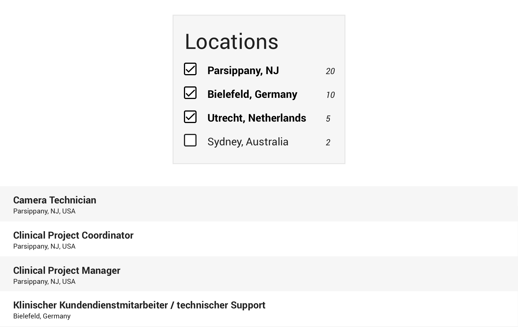
The requirements for the filter came from Marketing and HR. I was asked to design a simple filter that would filter job postings by location. I asked if further filtering, such as posting date, was necessary and was told that it was not. For the time being there were not going to be enough job postings to warrant granularity beyond location.
To go along with the filter, I also updated the format for the listings themselves to display the location of the job.
DESIGNING THE FILTER & WIREFRAMING
The requirements for the filter came from Marketing and HR. I was asked to design a simple filter that would filter job postings by location. I asked if further filtering, such as posting date, was necessary and was told that it was not. For the time being there were not going to be enough job postings to warrant granularity beyond location.
To go along with the filter, I also updated the format for the listings themselves to display the location of the job.
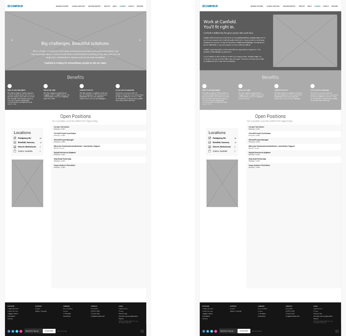
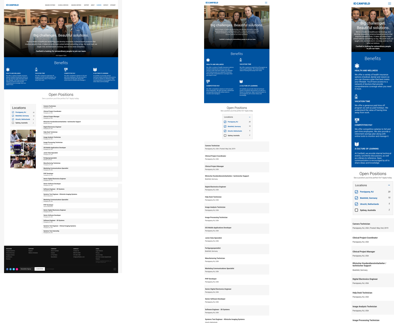
I presented these two wireframe options to our Marketing and HR teams both in-house and abroad as well as our CEO. In the end the decision was made to go with the option on the left.
LEFT: The hero image is now a carousel of images that will transition through a few photos of our teams.
RIGHT: The section that was at the very bottom is now the hero. Carousel of images at the right.
For both, the filter and jobs placement is consistent. The idea behind removing all content from below is to allow for future expansion. For instance: more filters, or introduction of pagination.
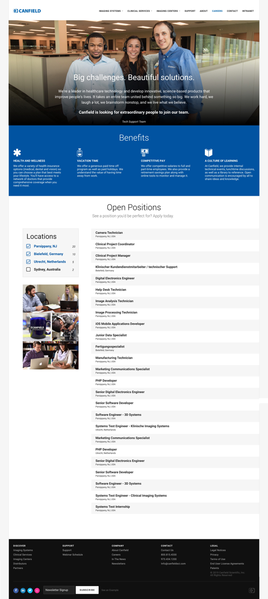
HIGH FIDELITY MOCKUP
This was my first opportunity to inject our newly minted Canfield Blue, a color I helped select, into our website. I think it found a natural home in the benefits section. I also rewrote each benefit’s heading for clarity and incorporated icons to draw the eye.
I worked closely with the developer to make sure the design was implemented correctly and helped define the default filter behavior.
CONCLUSION
All three of our additional teams report that they are regularly receiving applicants and that integration with our careers page went smoothly.
This is the most recent live update to our corporate website and part of a larger design overhaul in which I'm focusing on developing and incorporating brand guidelines.
♥︎ Have a great day!