iPAD APP REDESIGN
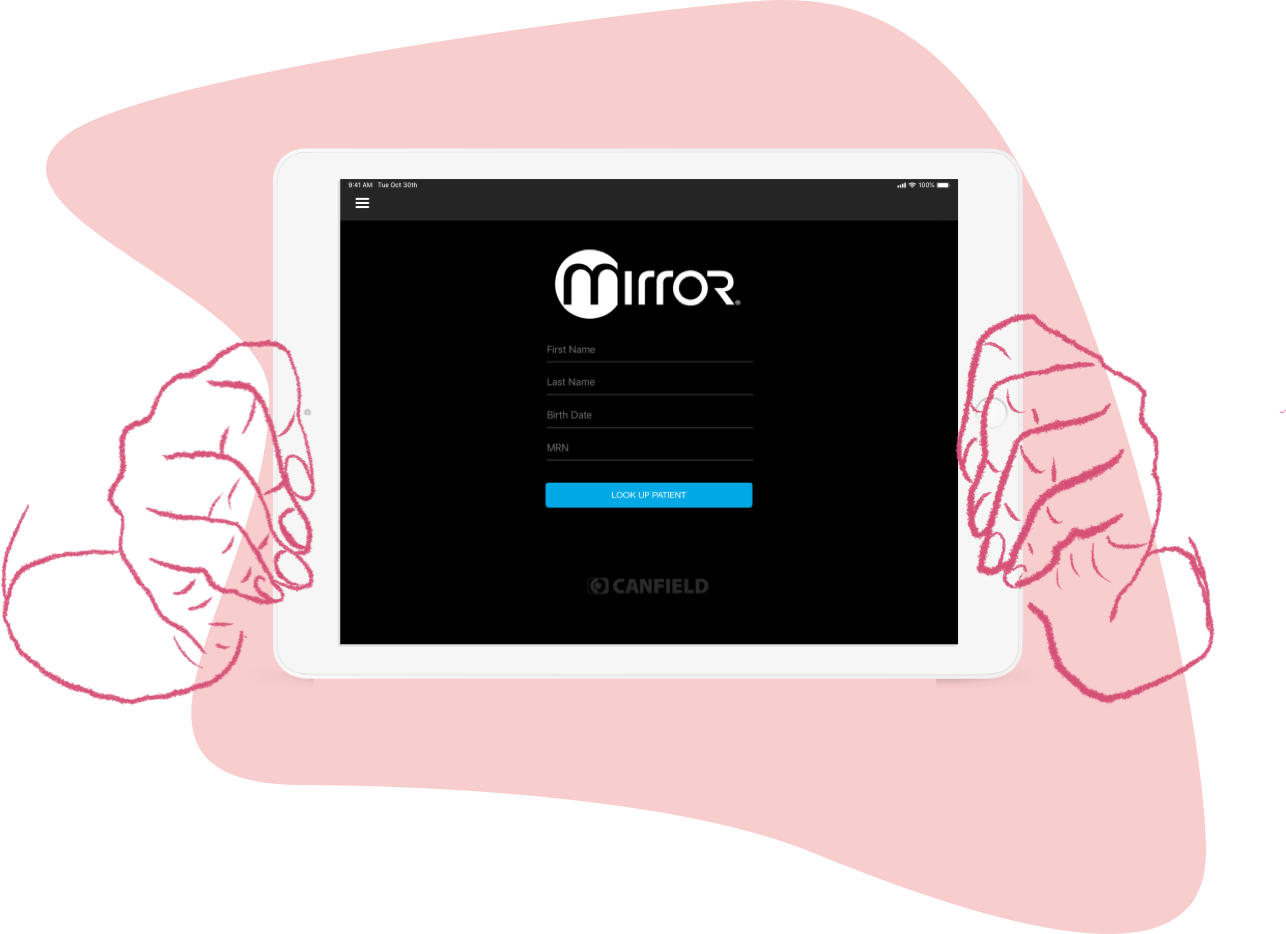
Mirror is an iOS iPad application that integrates with our hardware systems and acts as a consultation hub. Patients’ images are collected into a single chart, allowing for easy browsing from one place.
Role: Heuristic Evaluation, Competitive Analysis, Prototyping, Visual Design
INTRO
The mirror application had not seen many updates aside from bug fixes in quite some time. In order to increase adoption and introduce new features, a team consisting of me and two iOS developers worked closely with a plastic surgery practice to understand their needs. These needs were identified as being: an improved comparison mode and the ability to filter images within a chart. Additionally, I conducted a heuristic evaluation to improve existing areas of the UI so that these updates could be added alongside the new features.
INTRO
The NEXA iPad app was the first significant project I took on after getting hired at Canfield Scientific, Inc. The previous designer had taken the app partway through to high fidelity mockups and what existed had gone through to development. As such, I was asked not to alter anything drastically. I mostly worked on additional features and interactions throughout the app, maintaining consistency with established visuals but pushing where I felt it was necessary.
GOALS
GOALS

Allow users to go directly into a compare mode from the home screen without having to select images first. Remove the roadblock of having to exit back to the patient chart to select new images.
Change low contrast elements of the UI. Some elements are very faint and do not stand out against the dark grey interface.
Unify navigation elements so that they are all a combination of icons and text.
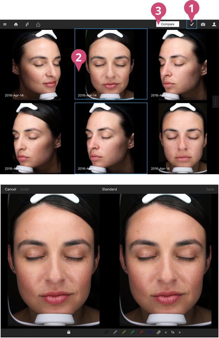
EVALUATING THE CURRENT INTERFACE
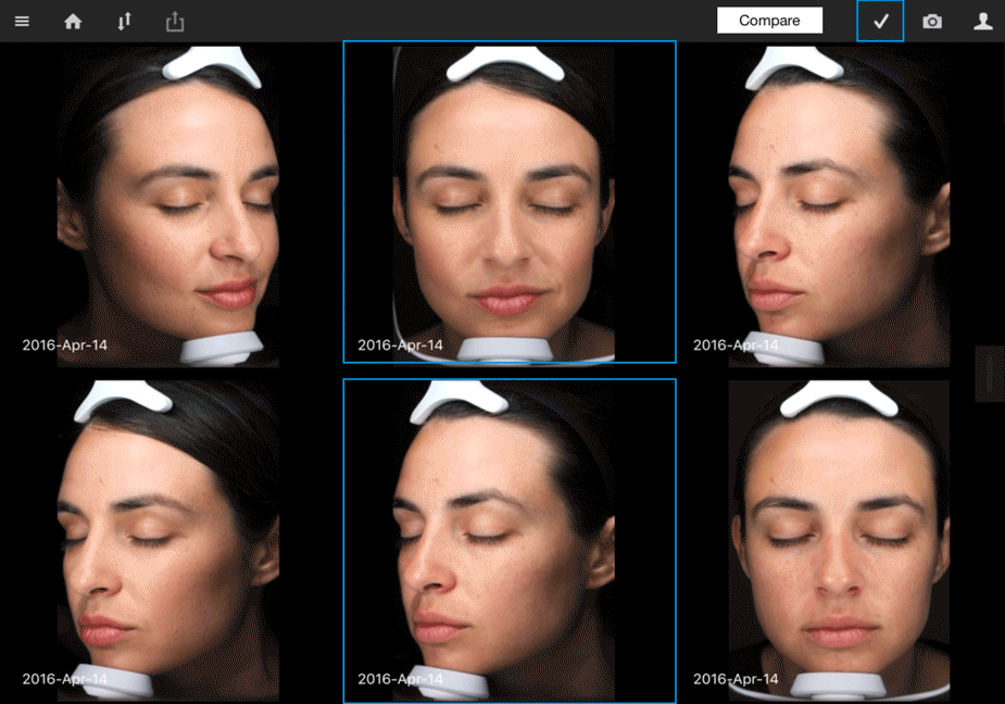
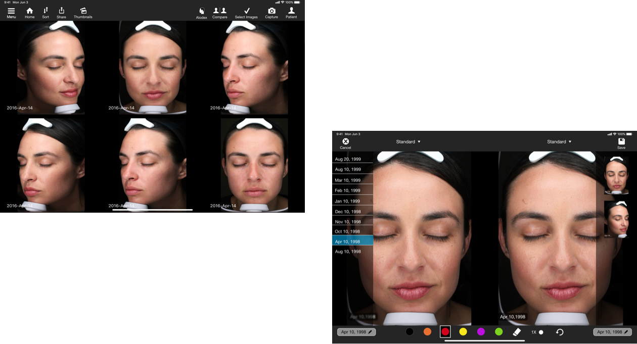
In talking with our users at the plastic surgery practice, they identified that the bulk of their consultations consisted of image comparison and that Mirror’s comparison feature left much to be desired. The feature in its current state was comprised of the following steps: Initiate selection mode and select two images to make the ‘compare’ button appear. Then tap the compare button to get to the comparison screen. In order to select alternate images, you’d have to exit back to the chart and redo the same steps.
I wanted to enhance this functionality by allowing the comparison mode to be accessed with or without selecting images beforehand. Once on the comparison screen, I wanted to introduce a way to select images without ever having to exit that screen.
EVALUATING THE CURRENT INTERFACE
In talking with our users at the plastic surgery practice, they identified that the bulk of their consultations consisted of image comparison and that Mirror’s comparison feature left much to be desired. The feature in its current state was comprised of the following steps: Initiate selection mode and select two images to make the ‘compare’ button appear. Then tap the compare button to get to the comparison screen. In order to select alternate images, you’d have to exit back to the chart and redo the same steps.
I wanted to enhance this functionality by allowing the comparison mode to be accessed with or without selecting images beforehand. Once on the comparison screen, I wanted to introduce a way to select images without ever having to exit that screen.
COMPETITIVE ANALYSIS AND PROTOTYPING
I reviewed our competitors and their offerings, noting the limitations of their compare features. For instance, having to select which side, right or left, to place the image the user selects. My prototype design incorporated the ability to select images individually on either side, making the process more straightforward. The image on the right side is selected with the menu on the right side, and the image on the left side is selected with the menu on the left side.
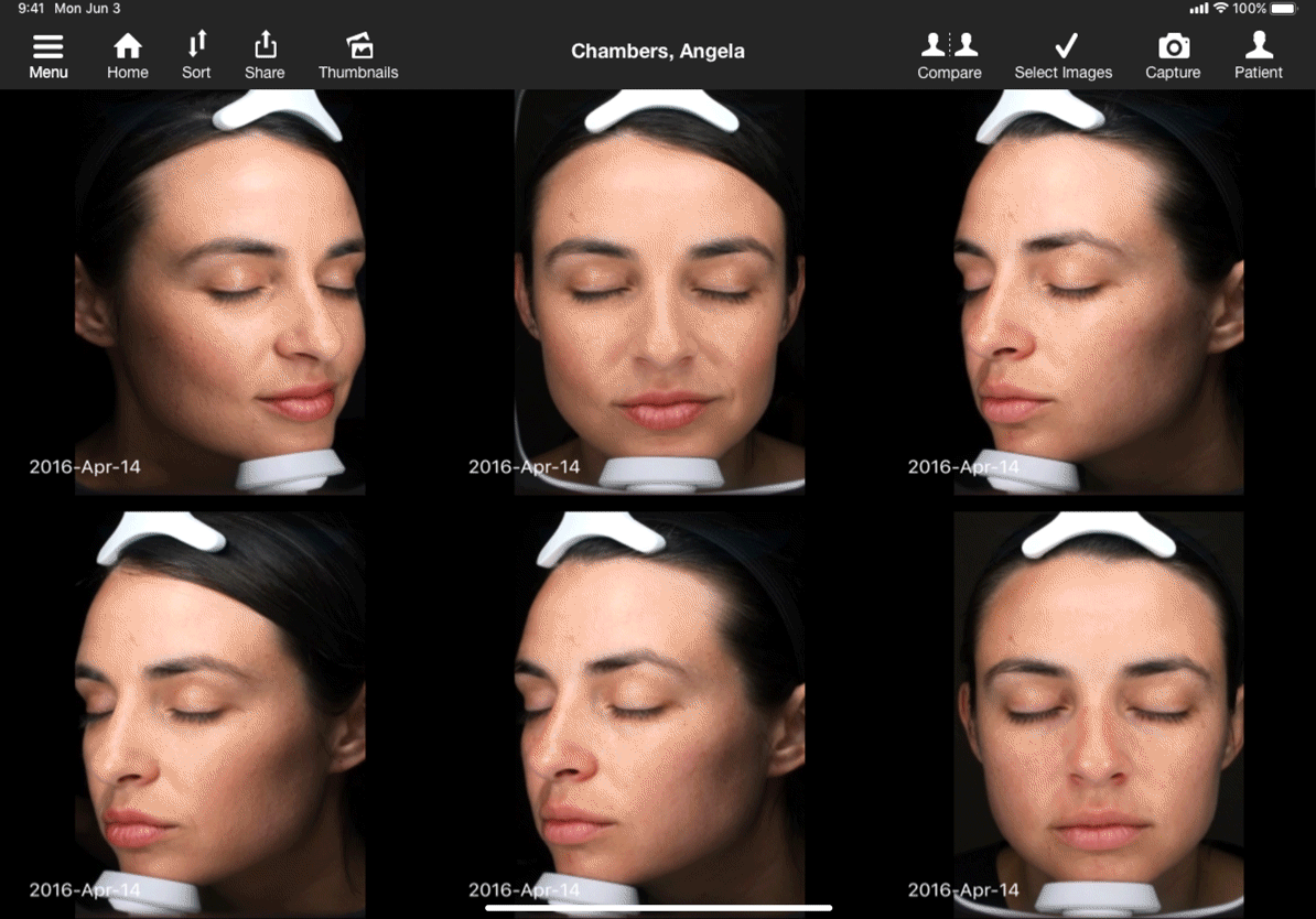
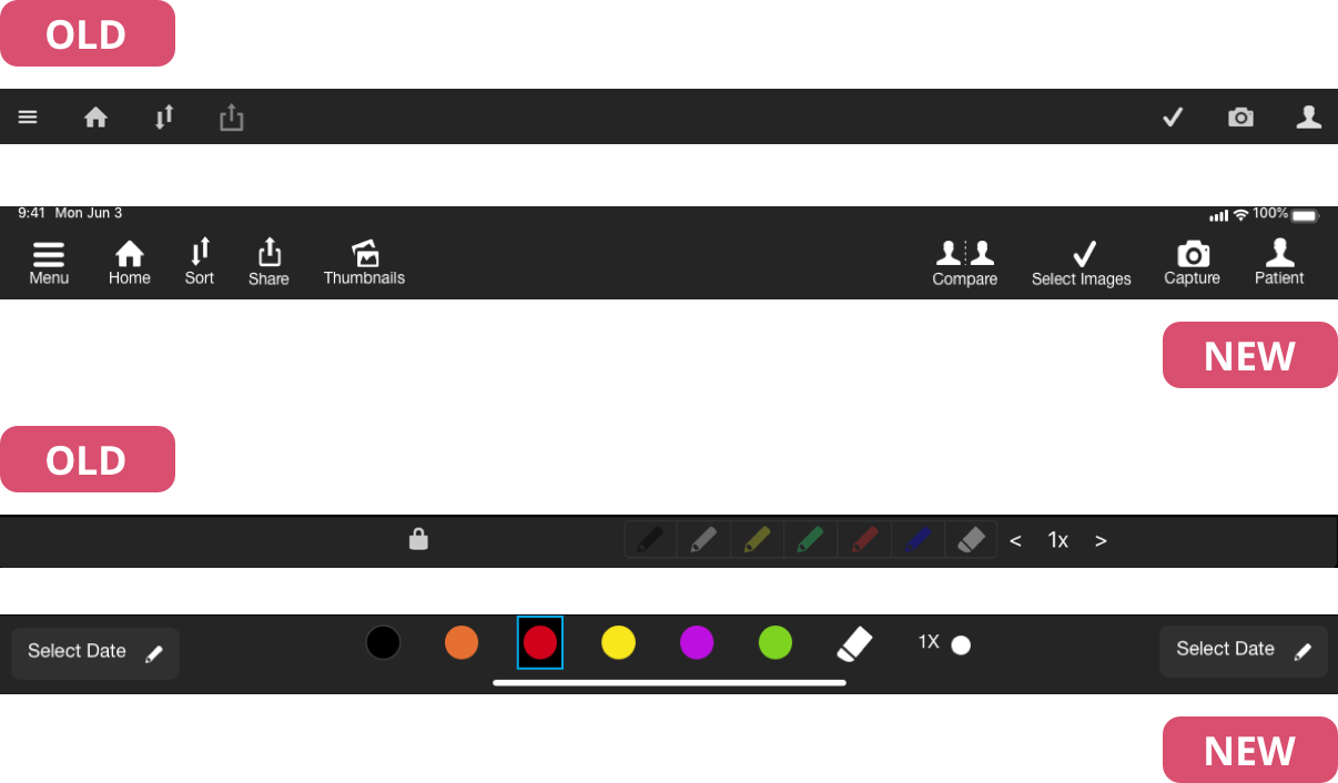
In addition to the above features, I noticed early on that many UI elements did not contrast enough against the dark background and proved very hard to see. The navigation was also inconsistent, sometimes a text link sometimes only an icon, so I wanted to make sure all menu elements were a combination of icons and text. I also increased the size of everything. I made both of these changes to improve the overall accessibility of the interface.
In addition to the above features, I noticed early on that many UI elements did not contrast enough against the dark background and proved very hard to see. The navigation was also inconsistent, sometimes a text link sometimes only an icon, so I wanted to make sure all menu elements were a combination of icons and text. I also increased the size of everything. I made both of these changes to improve the overall accessibility of the interface.
CONCLUSION
Working closely with users to understand their needs was both informative and rewarding. This was the first time I had direct access to any of our users and I believe that the overall improvements made to the app were that much more effective. If anything, this was the project that fueled my desire to incorporate more user research into my work and to one day conduct my own.
♥︎ Have a great day!