NOTIFICATIONS FEATURE CONCEPT
This is a side project I did to stretch my skills and do a deep dive into designing a feature that addressed a specific pain point.
Role: Persona creation, User Interview, Journey Mapping, Sketching/Wireframing, Prototyping, Visual Design
NOTIFICATIONS FEATURE CONCEPT
This is a side project I did to stretch my skills and do a deep dive into designing a feature that addressed a specific pain point.
Role: Persona creation, User Interview, Journey Mapping, Sketching/Wireframing, Prototyping, Visual Design
NOTIFICATIONS FEATURE CONCEPT
This is a side project I did to stretch my skills and do a deep dive into designing a feature that addressed a specific pain point.
Role: Persona creation, User Interview, Journey Mapping, Sketching/Wireframing, Prototyping, Visual Design
CANFIELD BEAUTY
Canfield Beauty is a new division of Canfield Scientific, Inc., created to market imaging hardware and software geared towards the beauty/skincare retail industry.
I worked directly with our marketing department to design a website that would introduce Canfield Beauty as a disctinct entity from Canfield Scientific. A more immediate purpose of this site was to help in the launch of NEXA®, Canfield Beauty’s flagship product.
NOTIFICATIONS FEATURE CONCEPT
This is a side project I did to stretch my skills and do a deep dive into designing a feature that addressed a specific pain point.
Role: Persona creation, User Interview, Journey Mapping, Sketching/Wireframing, Prototyping, Visual Design
INTRO
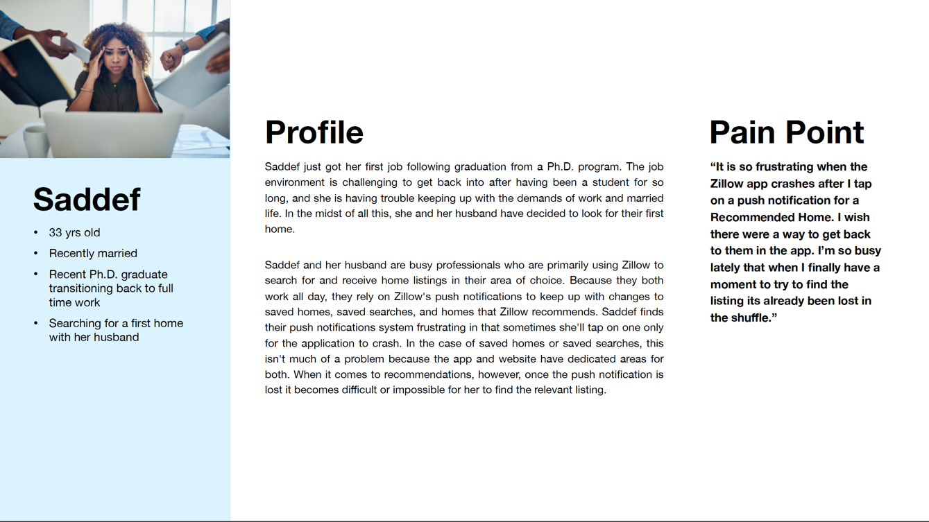
For this project, I wanted to take on a problem that someone I know has experienced. I decided to speak to my friend Saddef, who recently went through the home buying process. Considering the number of services out there purporting to make this process easier, I knew that I wanted to talk to her because there was a definite chance that she experienced something frustrating with one or more of them. Through talking with her, I formed the following persona and discovered a problem that I could work on solving.
INTRO
Canfield Beauty is a division of Canfield Scientific intended to target the retail beauty industry with services including analytics, customer insights, and technology to bring customers back to physical shopping. To design this website, I worked directly with the marketing department for copy and our in-house graphic designer for the logo and photo retouching. Everything else, including HTML and CSS, were my responsibility.
INTRO
For this project, I wanted to take on a problem that someone I know has experienced. I decided to speak to my friend Saddef, who recently went through the home buying process. Considering the number of services out there purporting to make this process easier, I knew that I wanted to talk to her because there was a definite chance that she experienced something frustrating with one or more of them. Through talking with her, I formed the following persona and discovered a problem that I could work on solving.
RESEARCH
I signed up for a Zillow account and downloaded the iOS app to experience notifications for myself. The app allows users to opt-in to push notifications for Saved Homes, Saved Searches, and Recommended Homes.
On both the website and mobile app, there is direct access to view both Saved Homes and Searches, but there does not appear to be an equivalent for Recommended Homes. Additionally, while Saved Homes and Searches are synced between the website and app, on first look there doesn’t seem to be an overt equivalent for Recommended Homes.
PLANNING
We began by identifying the pages that we needed to create and creating a preliminary outline for the content that they would contain.
RESEARCH
I signed up for a Zillow account and downloaded the iOS app to experience notifications for myself. The app allows users to opt-in to push notifications for Saved Homes, Saved Searches, and Recommended Homes.
On both the website and mobile app, there is direct access to view both Saved Homes and Searches, but there does not appear to be an equivalent for Recommended Homes. Additionally, while Saved Homes and Searches are synced between the website and app, on first look there doesn’t seem to be an overt equivalent for Recommended Homes.
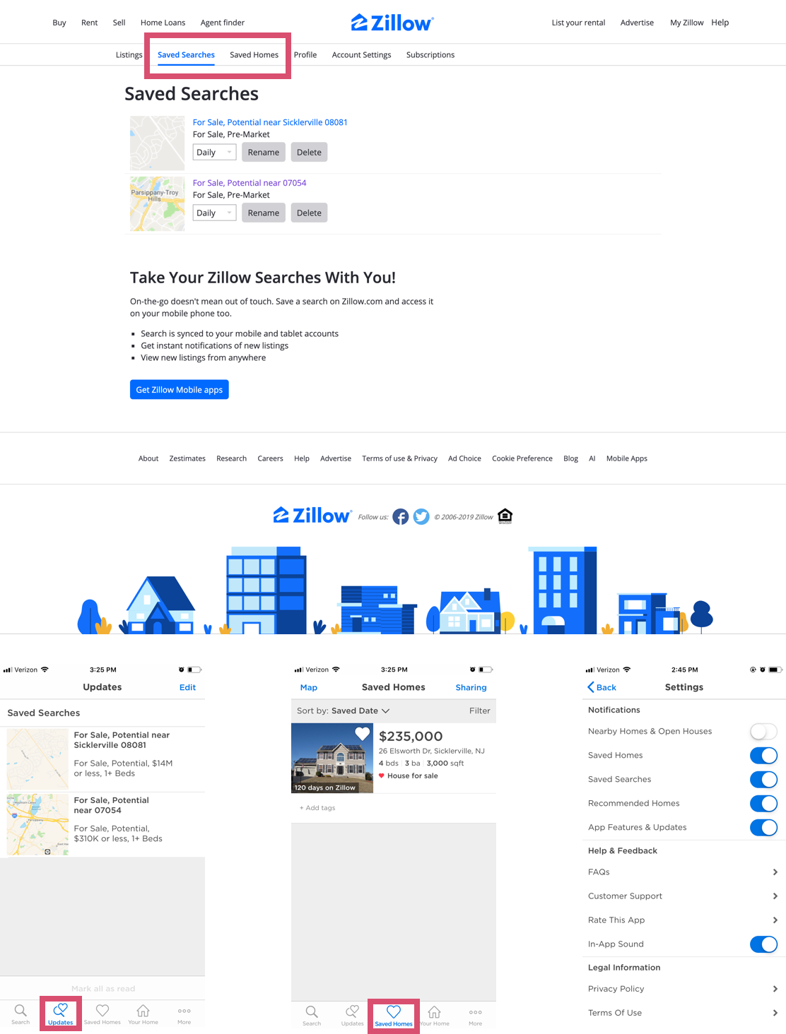
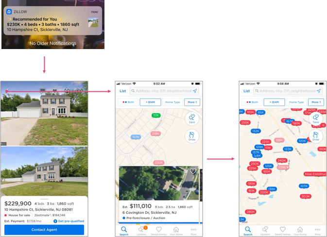
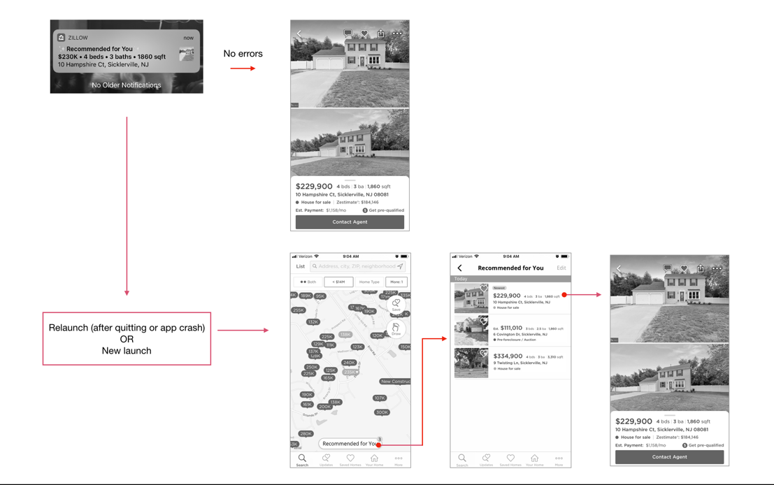
Tapping on a Recommended Home notification took me directly to the listing. If I backed out of the listing, I landed on the search screen which now had an added carousel, but it wasn't centered on the listing I just left. I assumed this carousel was for recommended homes but couldn’t be entirely sure. If I were someone who accidentally backed out of the listing too quickly, then I might have a hard time finding it again in that carousel.
If I quit the app entirely and then relaunched, the carousel was gone. This confirmed the issue that Saddef was having. Once the Recommended Home notification was gone, or the app crashed/quit, the only way to get back to that listing was to hunt for it.
With all this in mind, I outlined my design goals.
PLANNING
We began by identifying the pages that we needed to create and creating a preliminary outline for the content that they would contain.
Tapping on a Recommended Home notification took me directly to the listing. If I backed out of the listing, I landed on the search screen which now had an added carousel, but it wasn't centered on the listing I just left. I assumed this carousel was for recommended homes but couldn’t be entirely sure. If I were someone who accidentally backed out of the listing too quickly, then I might have a hard time finding it again in that carousel.
If I quit the app entirely and then relaunched, the carousel was gone. This confirmed the issue that Saddef was having. Once the Recommended Home notification was gone, or the app crashed/quit, the only way to get back to that listing was to hunt for it.
With all this in mind, I outlined my design goals.
GOALS
GOALS

Design a workflow for accessing and returning to Recommended Homes
Design a workflow for accessing and returning to Recommended Homes
Design a workflow for accessing and returning to Recommended Homes
Design a website that would introduce Canfield Beauty as a distinct entity from Canfield Scientific, in both style and content.
Provide an indicator (icon, button) that is dedicated to accessing Recommended Homes
Provide an indicator (icon, button) that is dedicated to accessing Recommended Homes
Provide an indicator (icon, button) that is dedicated to accessing Recommended Homes
Launch and introduce NEXA®, Canfield Beauty’s flagship product.
Provide an indicator (icon, button) that is dedicated to accessing Recommended Homes
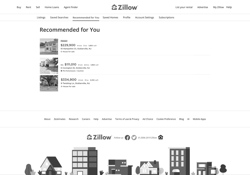
Mirror this experience for the web to maintain cross-platform consistency
Mirror this experience for the web to maintain cross-platform consistency
Mirror this experience for the web to maintain cross-platform consistency
Inform visitors how Canfield Beauty could benefit their beauty brand and attract people to their brick and mortar locations.
Mirror this experience for the web to maintain cross-platform consistency
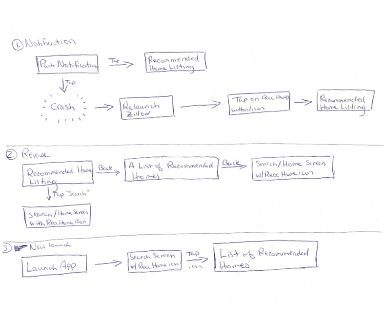
JOURNEY MAPPING
Based on my interview with Saddef and my interactions with the Zillow App, I knew that I wanted to create a button or icon that directly lead to a list of Recommended Homes right off the app’s home screen.
I outlined the three flows to the right. These cover:
1. What happens when a user taps on a push notification (with and without a crash)
2. What happens when you back out of a Recommended Home listing.
3. What happens if you launch the app without looking at your notifications at all.
PLANNING
We began by identifying the pages that we needed to create and creating a preliminary outline for the content that they would contain.
JOURNEY MAPPING
Based on my interview with Saddef and my interactions with the Zillow App, I knew that I wanted to create a button or icon that directly lead to a list of Recommended Homes right off the app’s home screen.
I outlined the three flows to the right. These cover:
1. What happens when a user taps on a push notification (with and without a crash)
2. What happens when you back out of a Recommended Home listing.
3. What happens if you launch the app without looking at your notifications at all.
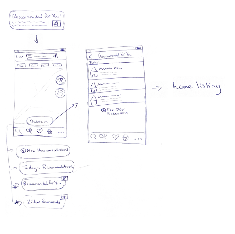
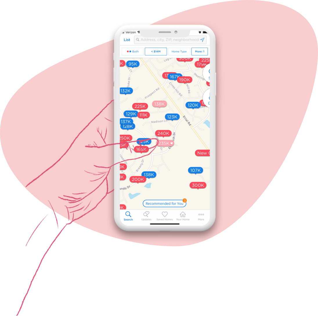
I knew I wanted to have a dedicated icon or button on the home screen that would lead directly to a list of Recommended Homes notifications. In sketching out where I wanted this button to go and what I wanted it to say, I decided to go with “Recommended for You”. I liked “Zillow Recommends” but that felt like it may be confusing and more indicative of a new feature.
I knew I wanted to have a dedicated icon or button on the home screen that would lead directly to a list of Recommended Homes notifications. In sketching out where I wanted this button to go and what I wanted it to say, I decided to go with “Recommended for You”. I liked “Zillow Recommends” but that felt like it may be confusing and more indicative of a new feature.
I knew I wanted to have a dedicated icon or button on the home screen that would lead directly to a list of Recommended Homes notifications. In sketching out where I wanted this button to go and what I wanted it to say, I decided to go with “Recommended for You”. I liked “Zillow Recommends” but that felt like it may be confusing and more indicative of a new feature.
PLANNING
We began by identifying the pages that we needed to create and creating a preliminary outline for the content that they would contain.
I knew I wanted to have a dedicated icon or button on the home screen that would lead directly to a list of Recommended Homes notifications. In sketching out where I wanted this button to go and what I wanted it to say, I decided to go with “Recommended for You”. I liked “Zillow Recommends” but that felt like it may be confusing and more indicative of a new feature.
WIREFRAMING
With the sketches in hand, I moved forward with mid-fidelity wireframes to further refine the workflows I outlined earlier.
WIREFRAMING
With the sketches in hand, I moved forward with mid-fidelity wireframes to further refine the workflows I outlined earlier.
WIREFRAMING
With the sketches in hand, I moved forward with mid-fidelity wireframes to further refine the workflows I outlined earlier.
SKETCHING
Once we had an working idea of what the content would be, I went on to start sketching ideas for how to display it, quickly going through several iterations before feeling comfortable enough to move on to the next step.
PROTOTYPE AND TESTING
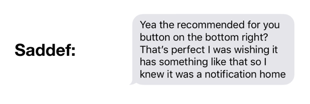
As a final step, I knew that I wanted to present Saddef with a prototype that she could interact with. My measurement for success in this exercise was seeing whether she could identify the new “Recommended for You” button and whether its functionality eliminated her pain point. By this metric, the new workflow was a resounding success.
Assuming that this was a large scale user test and not just based on an interview with my friend, elimination of this pain point would lead to more users successfully interacting with the Zillow app and the Recommended Homes feature, benefitting both user and business. Implementation of the updated workflow followed by collecting user feedback and further iteration if necessary seem like the logical next steps.
PROTOTYPE AND TESTING
As a final step, I knew that I wanted to present Saddef with a prototype that she could interact with. My measurement for success in this exercise was seeing whether she could identify the new “Recommended for You” button and whether its functionality eliminated her pain point. By this metric, the new workflow was a resounding success.
Assuming that this was a large scale user test and not just based on an interview with my friend, elimination of this pain point would lead to more users successfully interacting with the Zillow app and the Recommended Homes feature, benefitting both user and business. Implementation of the updated workflow followed by collecting user feedback and further iteration if necessary seem like the logical next steps.
WIREFRAMING & PROTOTYPING
From sketches, I moved on to creating medium-fidelity wireframes in Sketch, to better communicate ideas with my colleagues.
At this point, an obvious challenge for the NEXA product page was the amount of content that I had to plan for. Laying out all the content sequentially would result in a page that scrolled for a very long time. I had to devise a solution that allowed for all the content to be displayed but also resulted in an easy to skim page for the end user.
PROTOTYPE AND TESTING
As a final step, I knew that I wanted to present Saddef with a prototype that she could interact with. My measurement for success in this exercise was seeing whether she could identify the new “Recommended for You” button and whether its functionality eliminated her pain point. By this metric, the new workflow was a resounding success.
Assuming that this was a large scale user test and not just based on an interview with my friend, elimination of this pain point would lead to more users successfully interacting with the Zillow app and the Recommended Homes feature, benefitting both user and business. Implementation of the updated workflow followed by collecting user feedback and further iteration if necessary seem like the logical next steps.
CONCLUSIONS
The research that I used for this exercise is based on questions I asked Saddef and observations I made via my interactions with the Zillow app and website. The other pieces of this research would come from the business. I would want access to documentation and team members to learn about the Zillow app and get answers to questions like: Why is the Recommended Homes workflow implemented the way that it is?, Were improvements previously attempted or implemented?, Did this result in an adverse effect?, What was the adverse effect?, etc. Understanding why the Recommended Homes flow is the way that it is and what percentage of users utilize it or find it helpful would provide further insight into whether designing for this use-case would lead to beneficial returns for the business.
This exercise was a wonderful way for me to go through the product design process from start to finish. It made me even more interested in being able to conduct user research in my day to day design process.
♥︎ Have a great day!